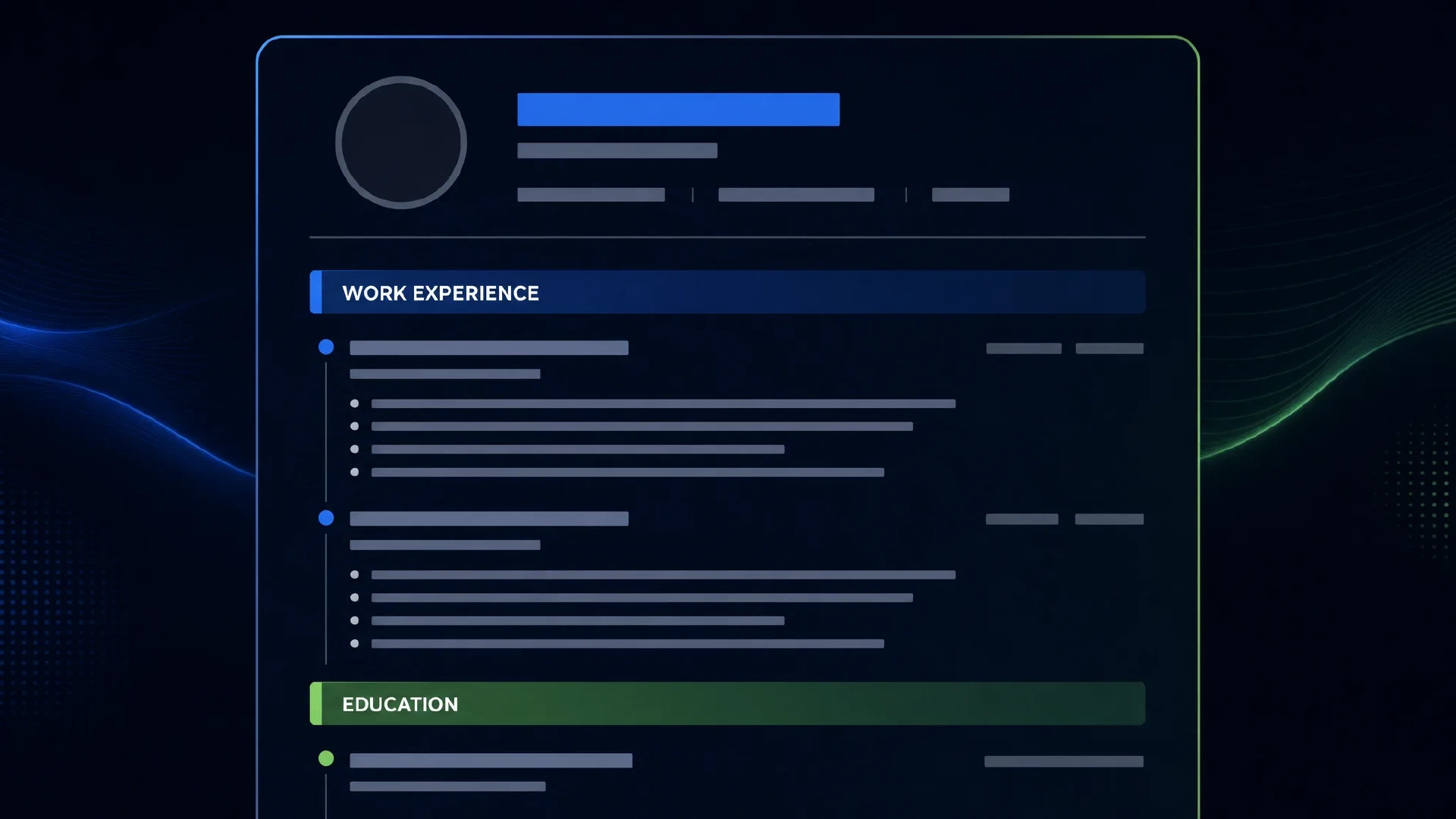

Module 2: Resume Formatting — Layout Rules That Survive ATS Parsing

Table of Contents
← Return to the Resume Optimization Course
The most common reason strong resumes score poorly is formatting — not content. Tables, text boxes, multi-column layouts, and graphic-heavy templates look polished as PDFs but produce garbled output when ATS software extracts the text it actually scores.
This module takes about 10 minutes. After reading it, you’ll know exactly which formatting choices help and which silently destroy your ATS score.
The Core Rule: ATS Parses Text, Not Design
ATS software extracts text from your resume file. It doesn’t “see” your resume the way a human does. What matters is whether the extracted text is clean, ordered, and categorizable.
A resume that parses cleanly:
- Has text in one logical reading order (top to bottom, left to right)
- Uses standard headings the parser can recognize
- Has no content locked inside tables, text boxes, columns, or graphics
- Has contact information in the body — not in a header or footer
What to Do
Single-Column Layout
Use a single-column layout. This is the most important formatting rule.
Two-column layouts and sidebar designs look clean on screen. When ATS software reads them, it typically merges both columns into a single stream — reading left-column text next to right-column text on the same line. Your skills section gets interspersed with your job history. Dates appear mid-sentence. The result is unparseable.
Single-column is not a design limitation. It’s an ATS requirement.
Standard Section Headers
Use headers the ATS parser recognizes:
| Use This | Not This |
|---|---|
| Work Experience | “My Journey,” “Career History,” “Where I’ve Been” |
| Education | “My Background,” “Academic Story” |
| Skills | “My Toolkit,” “What I Know,” “Tech Stack” |
| Projects | “Things I’ve Built,” “Side Work” |
| Certifications | “Credentials,” “Licenses and Certs” |
| Summary | “About Me,” “Profile,” “At a Glance” |
Parsers look for pattern matches against known section names. Creative names reduce the parser’s confidence in categorizing your content.
Fonts
Use fonts that are universally installed and render cleanly at print resolution:
- Recommended: Calibri, Garamond, Georgia, Arial, Times New Roman, Helvetica
- Avoid: Custom fonts, downloaded fonts, icon fonts, anything requiring a font file
Font sizes:
- Your name: 14–16pt
- Section headers: 11–13pt
- Body text: 10–12pt
Nothing below 10pt (hard to read in print) and nothing above 16pt (wastes space).
Margins
Keep margins between 0.5 inches and 1 inch.
- Below 0.5 inches: looks cramped, hard to print cleanly
- Above 1 inch: wastes space, pushes content to a second page unnecessarily
Bullet Points
Use real typographic bullet points (•), not dashes (–), hyphens (-), or custom symbols. Some ATS systems misparse non-standard characters and strip the leading character from your bullet text.
In Word: Insert → Symbol or use the built-in list style. In Google Docs: Format → Bullets & numbering.
Date Formatting
Pick one format and use it everywhere:
Jan 2022 – Mar 2024(month abbreviation + year)01/2022 – 03/2024(numeric)
Do not mix formats within the same resume. Inconsistent date formatting confuses parsers and looks sloppy to humans.
Bold for Scannability
Bold your job titles, company names, and dates so a human can scan your experience in 5 seconds. Bold communicates hierarchy and helps the human reader understand your resume before reading every word.
Do not bold entire sentences or paragraphs.
What to Avoid
Tables and Text Boxes
Tables and text boxes are the most common formatting traps.
A two-column that looks like this on screen:
Microsoft | Software Engineer | Jan 2022 – Present
• Built distributed event pipeline
May extract as this when parsed:
Microsoft Software Engineer Jan 2022 – Present Built distributed event pipeline
Or worse — the table content may be dropped entirely.
Remove all tables from your resume. Use plain text with consistent indentation instead.
Headers and Footers
ATS software frequently ignores or garbles content in page headers and footers. Do not put your name, contact information, or page numbers in the page header/footer. Put contact information in the body of the first page.
Graphics, Logos, and Photos
Graphics are not parsed. Any content inside an image is invisible to the ATS. This includes:
- Profile photos
- Company logos
- Skill rating bars (circular or linear)
- Decorative icons next to section headers
If you use a skill rating bar with stars or a percentage fill to indicate proficiency, the ATS sees nothing. Remove all graphics entirely.
Color
One accent color (used sparingly for section headers or lines) is fine. More than one accent color adds no value and can cause formatting issues in some ATS systems that convert documents before parsing.
Canva and Design Tool Templates
Canva, Adobe Express, and similar tools produce visually polished resumes. They almost universally use multi-column layouts, graphics, and custom fonts. The resulting PDFs parse poorly.
A well-formatted plain resume in Word or Google Docs outperforms a beautiful Canva template for ATS scoring — every time.
Formatting Checklist
- Single-column layout
- Standard section headers (Work Experience, Education, Skills, Projects, Certifications)
- System font (Calibri, Arial, Georgia, or similar)
- 10–12pt body text, 14–16pt name
- 0.5–1 inch margins
- Real bullet points (•)
- Consistent date format throughout
- Contact info in body, not header/footer
- No tables or text boxes
- No graphics, photos, or icons
Run your formatted resume through the ATS Resume Improver “What the ATS Sees” view. If the extracted text matches your document’s content in correct order, your formatting is clean.
Next Steps
Formatting keeps your content parseable. Now let’s make sure your content is worth reading.
→ Module 3: Writing Your Summary
Or return to the course hub: Resume Optimization Course Start